BRANDING CASE STUDY
Tandoori Oye
Case Study
A high-energy Punjabi brand with bold visuals and a playful voice that instantly stands out and feels share-worthy.
BRANDING CASE STUDY
A high-energy Punjabi brand with bold visuals and a playful voice that instantly stands out and feels share-worthy.


Tandoori Oye, a Punjabi restaurant in Jamshedpur, wanted a brand that’s fun, modern, and full of Punjabi energy, something that stands out beyond traditional restaurant branding.
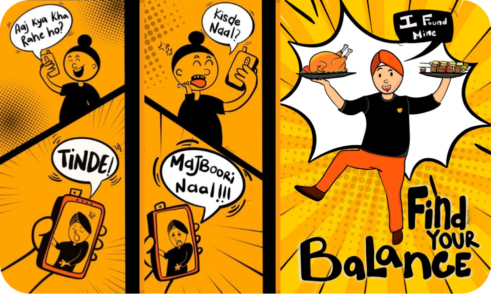
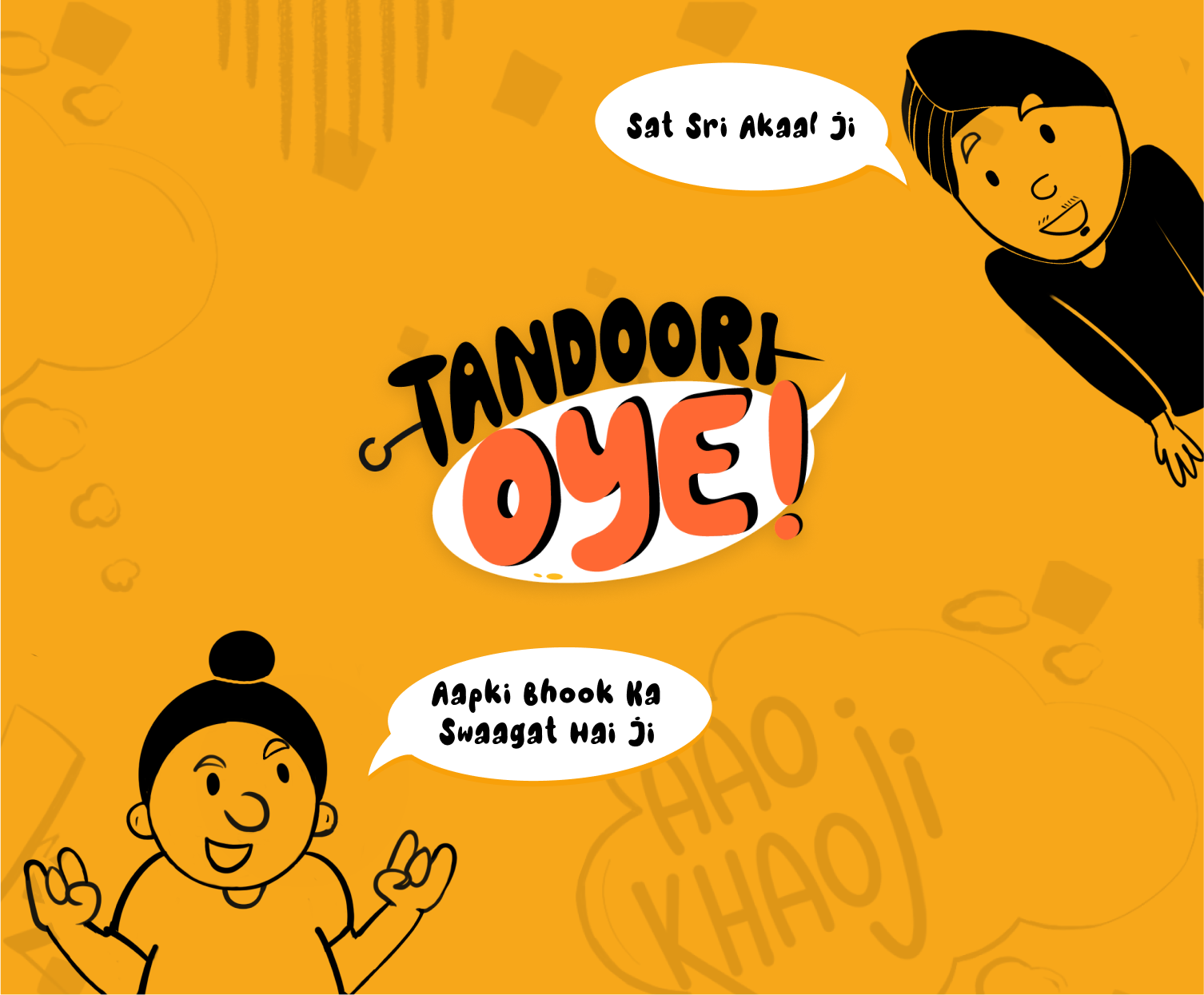
Fun characters to tell the brand story
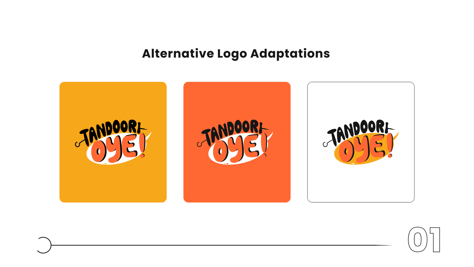
Logo with a stick (da danda) symbolizing authentic Punjabi cuisine
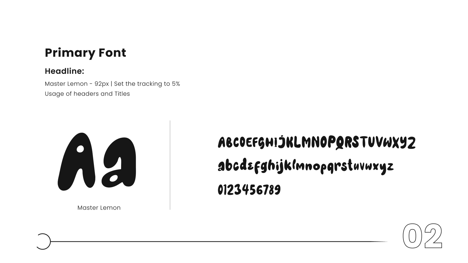
Bright yellow & orange palette with bold, friendly typography
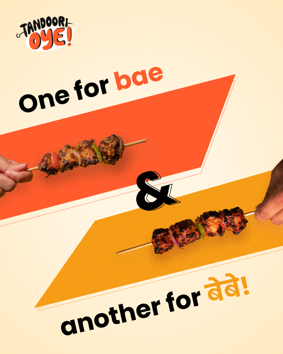
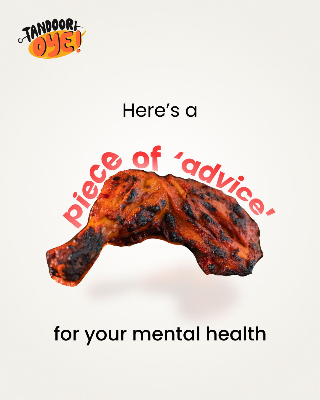
Playful tone across menus, socials, and visuals
Tandoori Oye now has a distinct, memorable personality that resonates with customers, which feels authentic, share-worthy, and instantly recognizable.