BRANDING CASE STUDY
51 Estate
Case Study
We built a calm, well-structured brand system that blends professionalism with warmth to build client confidence.
BRANDING CASE STUDY
We built a calm, well-structured brand system that blends professionalism with warmth to build client confidence.
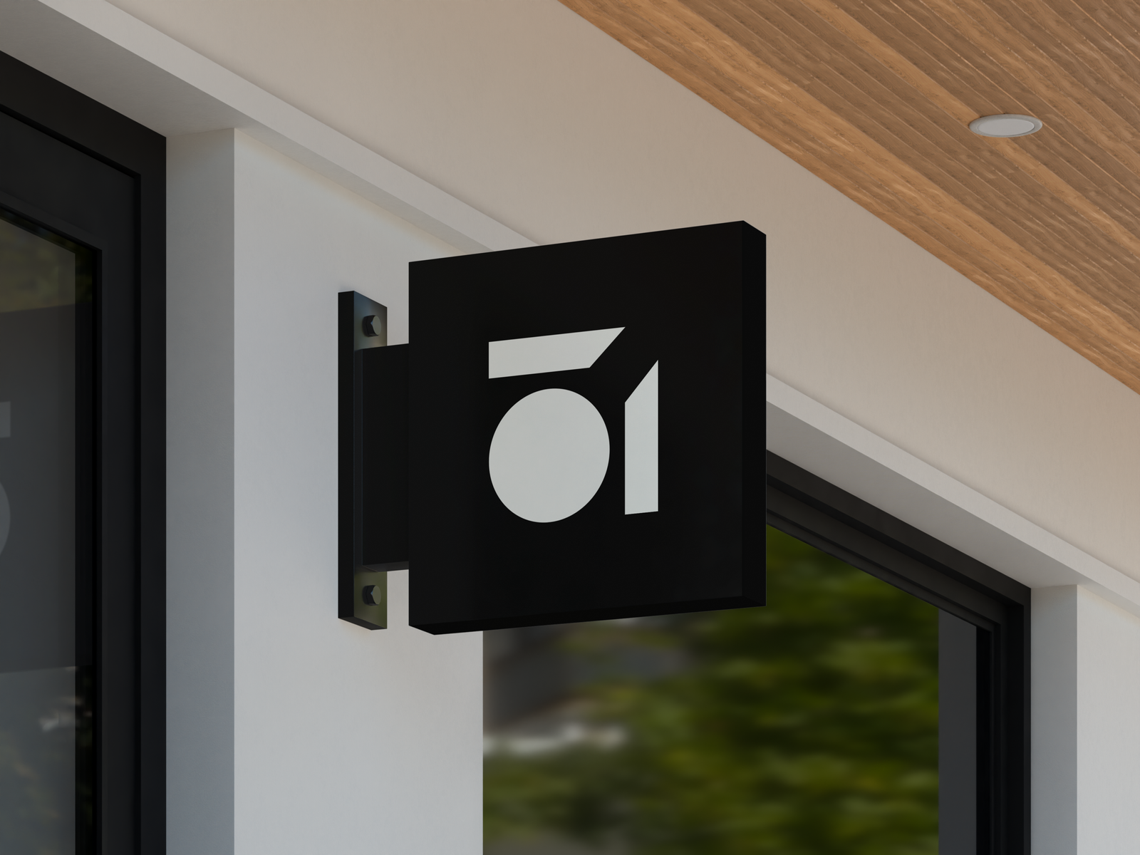

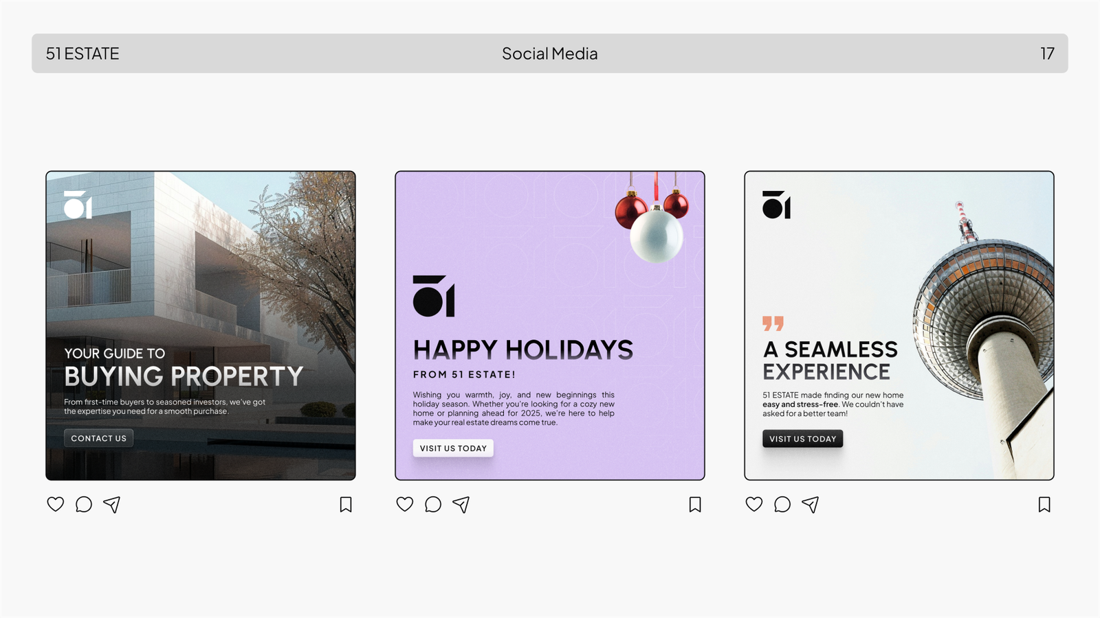
51 Estate, a real estate brand from Germany, wanted a brand identity that communicates professionalism while remaining friendly and approachable, reflecting their commitment to client trust and user-centric service.
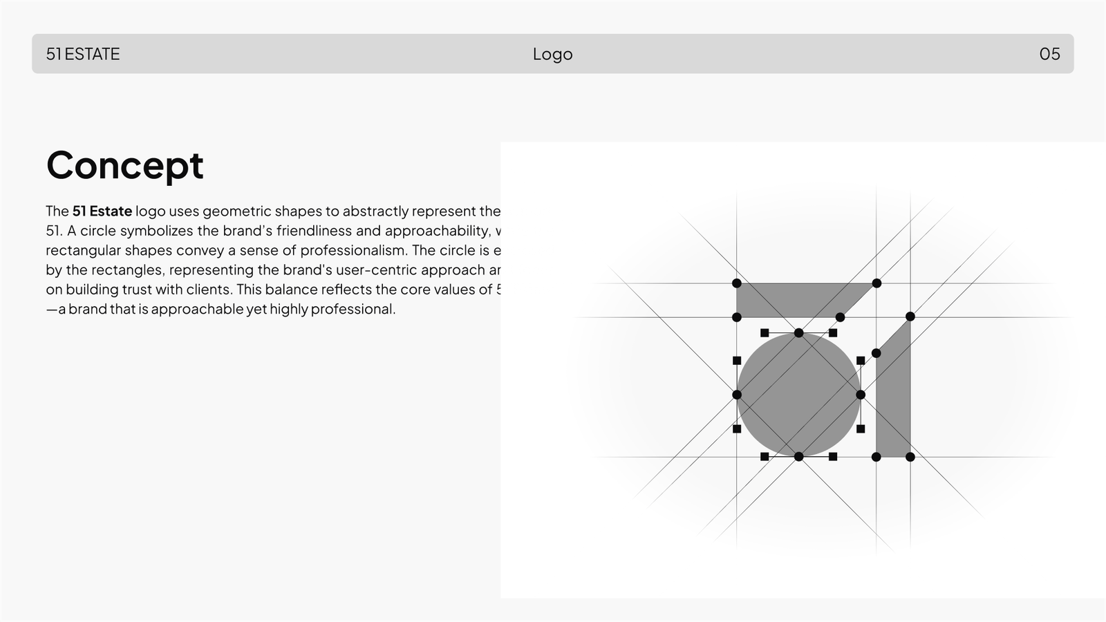
Symbolic shapes: A circle for friendliness, embraced by two rectangles for professionalism and structure.
Balanced design: The combination mirrors 51 Estate’s core values of approachability and trust, fitting German expectations of efficiency with warmth.
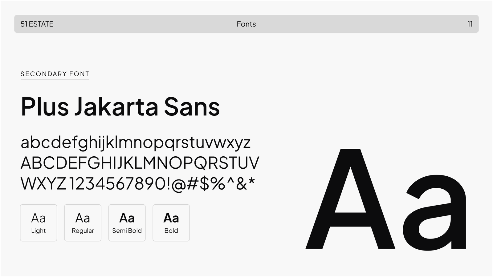
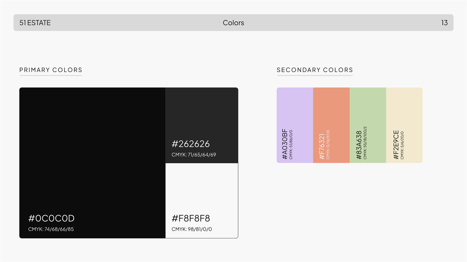
Typography & colors: Urbanist (primary) for modern, clean professionalism; Plus Jakarta Sans (secondary) for readability and versatility.
A user-centric, balanced identity that communicates professionalism while remaining approachable, perfectly resonating with the German market’s preference for trustworthy, client-focused brands.