BRANDING CASE STUDY
Andam Sarees
Case Study
We refined the visual identity that celebrates tradition while feeling modern and memorable.
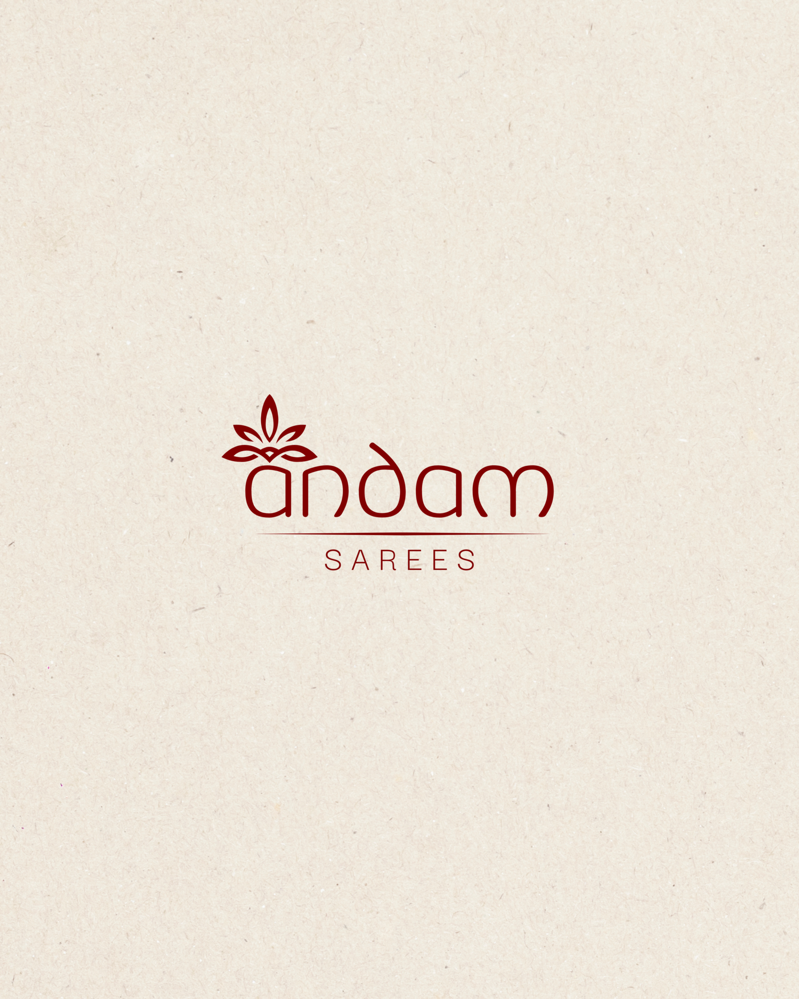
BRANDING CASE STUDY
We refined the visual identity that celebrates tradition while feeling modern and memorable.
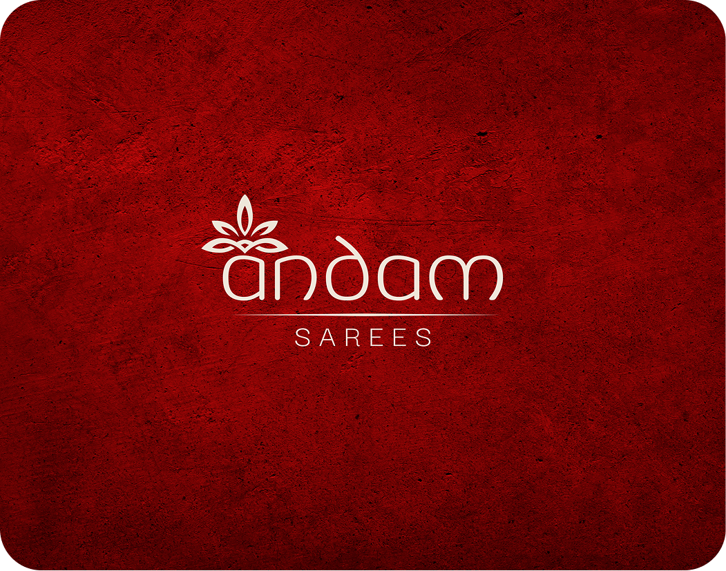


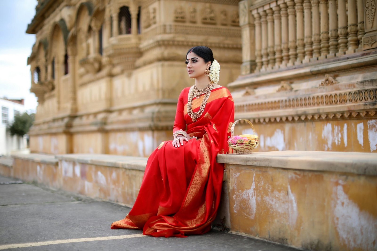
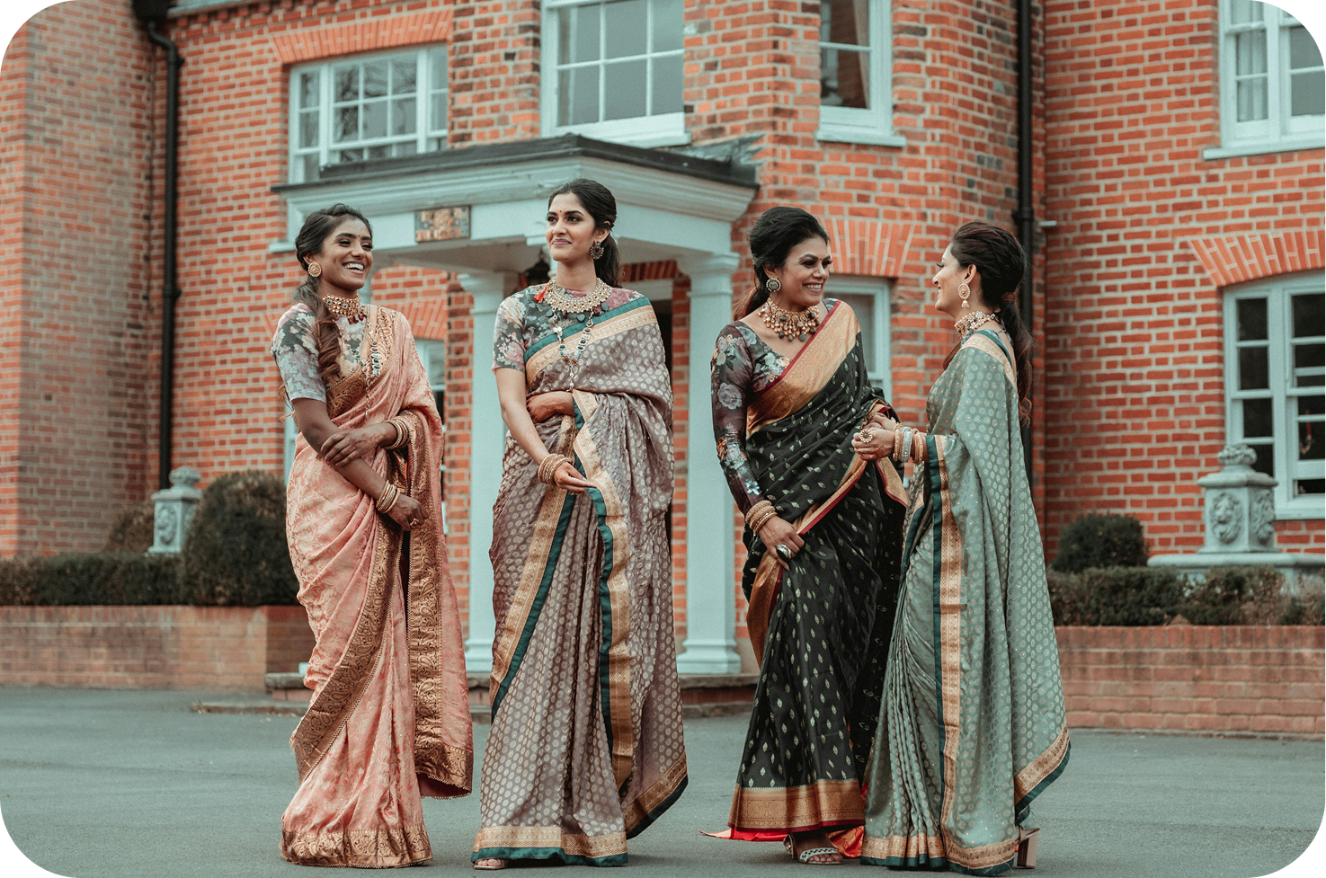
Andam Sarees wanted a brand identity that celebrates the timeless beauty, elegance, and cultural richness of sarees while feeling modern and memorable.
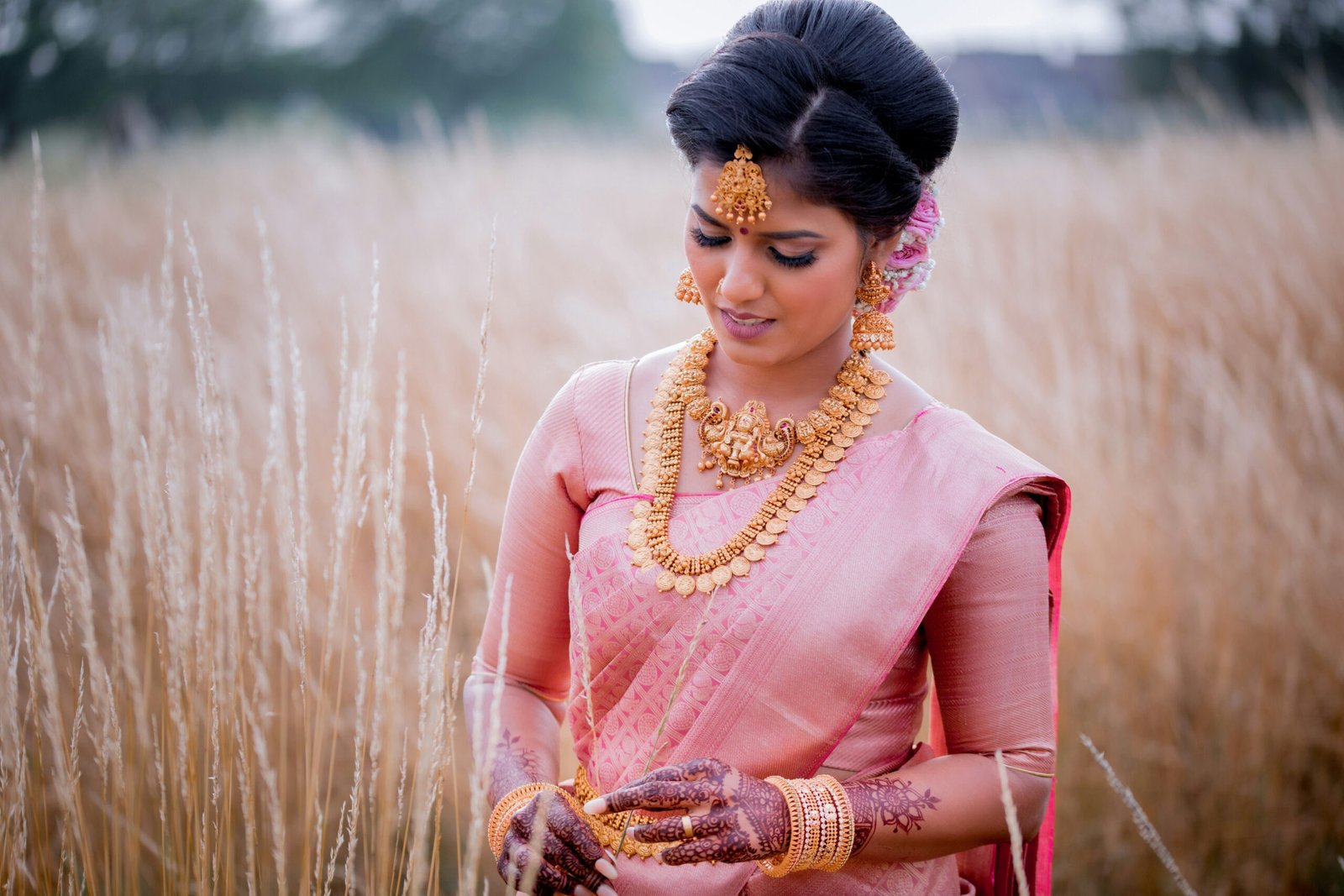
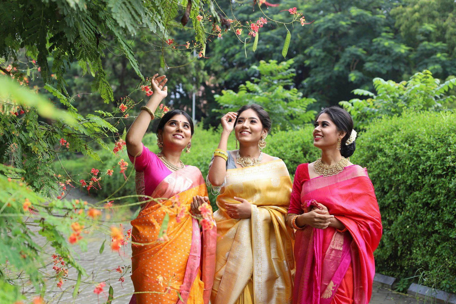

A distinct flower-inspired symbol formed from the letter ‘d’ representing growth, femininity, and the timeless charm of sarees
Standalone recognition is strong enough to be recognizable without the brand name
Rich red palette evokes heritage, strength, and elegance
Sleek typography balances simplicity with cultural depth, reflecting modern sophistication
A minimal, meaningful identity system that feels authentic, elegant, and distinctly Indian — perfectly capturing Andam Sarees’ heritage and modern appeal.