BRANDING CASE STUDY
Fingrowth
Case Study
We created a sharp, professional identity that signals growth and market expertise while still feeling easy to trust.
BRANDING CASE STUDY
We created a sharp, professional identity that signals growth and market expertise while still feeling easy to trust.



FinGrowth wanted a brand identity that conveys expertise in the stock market while remaining approachable and trustworthy for clients seeking financial guidance.



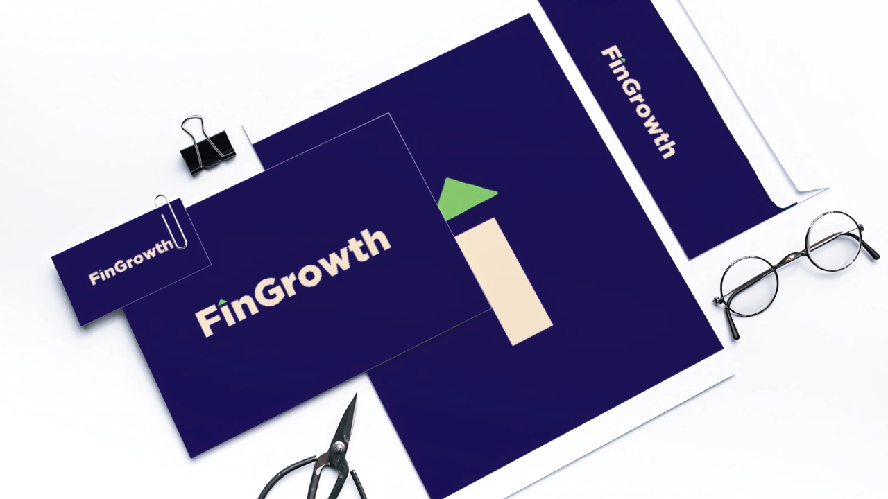
Upward arrow dot on the “i” features an arrow symbolizing growth and the stock market
Professional blue as primary, green as secondary to signify growth
Clean, authoritative design builds trust while blending expertise with approachability
A professional, trustworthy identity that communicates growth, inspires confidence, and positions FinGrowth as an expert yet approachable financial brand.